Reimagining Cobalt

Building the team, systems, and AI-assisted ways of working to shape a new product experience.

THE SHORT VERSION
Rebuild the team. Rethink the experience. Change how we design.

I joined Cobalt to bring new creativity to the product, incorporate AI into design workflows, and build the UX team. Our staff designer had arrived just one week earlier, and no designers remained from the original team.

I hired two designers and established product ownership, research, measurement, and design operations—while personally leading much of the hands-on work on the design language and system.

Keith is an impressive leader and hands-on designer. At Cobalt, we defined new ways to apply cutting-edge AI tools to our teams’ daily development process. He’s a great colleague and fellow explorer.
Mike GaronVP of Engineering, Cobalt
My roleUX leader, hands-on designer, and researcher
TeamUX, Product, Engineering & Brand
ScopeUX team and practice • Research and measurement • Design system • Product vision
REBUILD THE TEAM

Rapidly rebuilding the UX team

I joined Cobalt with an ambitious mandate to transform the product experience, but there was one significant challenge: we were essentially starting from scratch.

With just one designer who had joined the week before me, I moved quickly to assemble the team. Within my first three weeks, I hired two exceptional designers, Lais and Cristian, each bringing complementary skills, perspectives, and strengths.

Rather than building a team of generalists, I wanted individuals who could own their work, challenge assumptions, and collectively raise the bar for design.

Player 1ChrisStaff UX Designer
  • UX Strategy
  • Interaction Design
  • Prototyping
  • Design Systems
SPECIAL POWERTurns complexity into clarity
Chris, illustrated as a game character

A shared identity and rhythm for working together

Hiring was the beginning. With everyone new to Cobalt, and no shared history to lean on, I created ways for us to learn about each other, share work openly, and establish a common rhythm. These small rituals helped a brand-new team build trust quickly, see each other as people as well as designers, and start working like one team from the very first weeks.

An identity of our own.

I designed a UX team logo based on the Cobalt logo to give our new group a shared identity.

Going beyond the role

I created personal boards where we could share our backgrounds, interests, inspirations, and quirks.

Lais Lara’s personal board. 1 of 4. Click or tap to shuffle.

Weekend updates

A weekly space for non-work moments: pets, projects, family, and the everyday adventures we brought back from our weekends.

A botanical drawing in progress. 1 of 4. Click or tap to shuffle.

Click or tap to shuffle

Establishing new rhythms for work

Give UX a shared home

I partnered with Product Operations to establish UX in Jira, making design work visible and connecting it to product initiatives.

Make feedback a habit

I established recurring design critiques and team ceremonies so we could share work in progress, exchange perspectives, and refine ideas together.

A little craft, a lot of appreciation

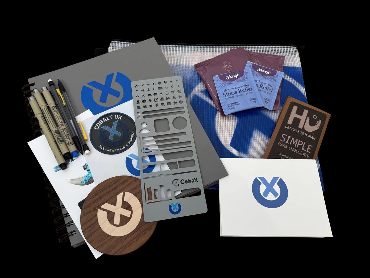
I’m a maker at heart, and I wanted each person on the team to have something made just for them. I put together personalized swag bags with a 3D-printed stencil of elements from our design system, a wood coaster, custom thank you cards, a tote bag, a sketchbook, and stickers.

It was a hands-on way to turn our team identity into something tangible—and show people that their contributions mattered. A dedicated budget wasn’t always there, but I didn’t want appreciation to wait for one.

Personalized Cobalt UX team swag: a design-system stencil, wood coaster, cards, tote bag, sketchbook, and stickers.
UNDERSTANDING WHAT NEEDED TO CHANGE

Problems holding the product back

An aging front end, inconsistent patterns, and organically grown navigation shaped the experience. We needed to understand the problems in context and turn them into actionable work.

POOR INFORMATION ARCHITECTURE

More features. Less structure.

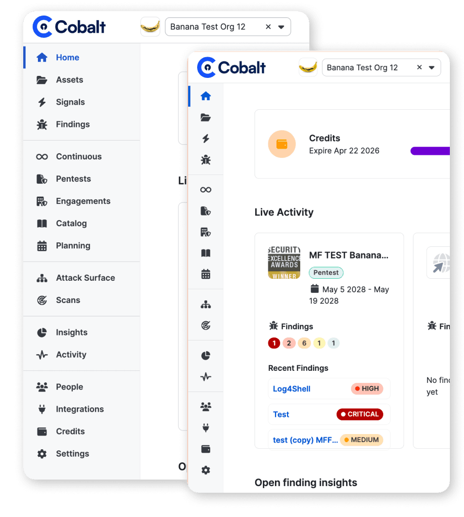
The navigation had grown feature by feature, with new destinations added as capabilities shipped. Without clear grouping or a shared organizing principle, it reflected the product’s development history more than the tasks customers needed to accomplish.

Cobalt navigation
Cobalt navigation
INTERACTION PATTERN ISSUES

Same task. Different rules.

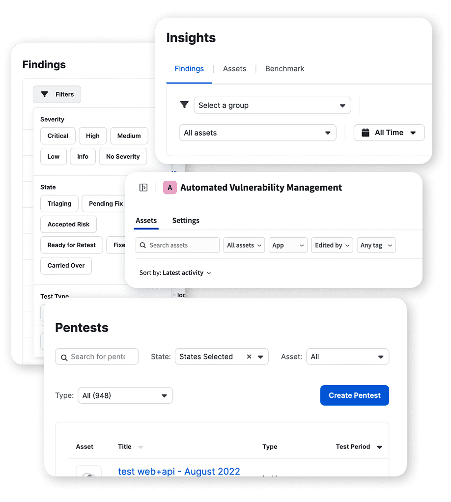
Similar tasks worked differently across the product, with inconsistent controls, layouts, and interaction patterns. Without a maintained set of shared components, workflows continued to diverge—requiring users to relearn familiar actions as they moved between areas.

Various filtering patterns
BRAND & PRODUCT

One company. Two visual identities.

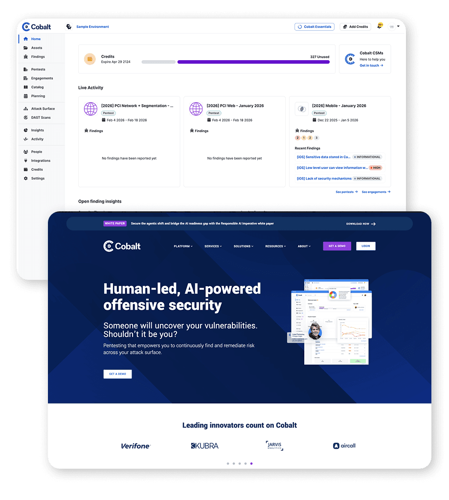
Marketing and product used different typography, color treatments, and illustration styles, creating a visible disconnect between the two. Without a shared design language, the brand customers encountered on the website didn’t carry through to the product they used.

Cobalt product (top) vs. marketing site (bottom)

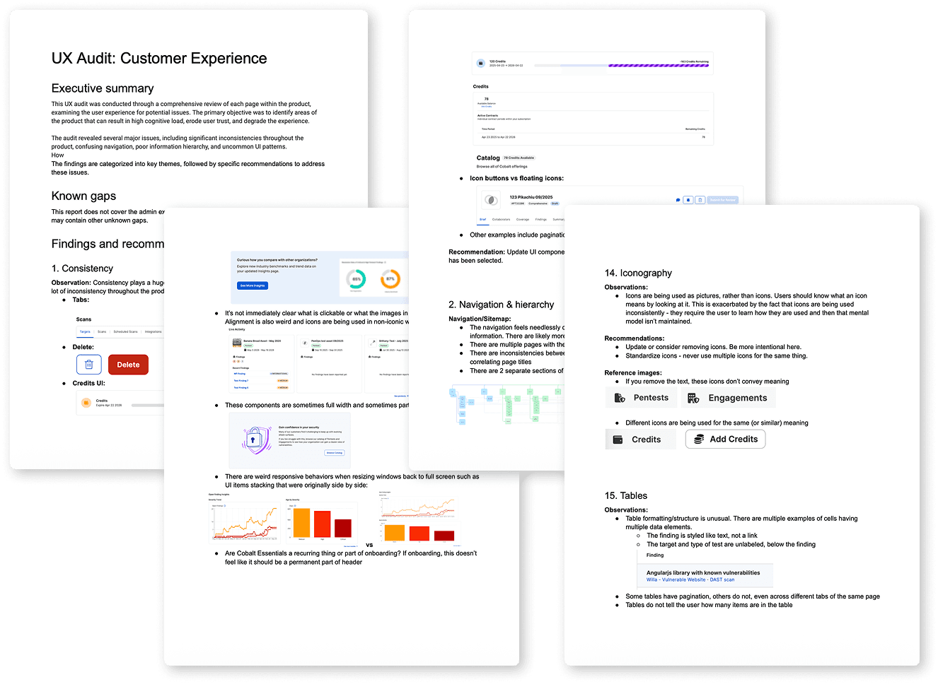
Every audit finding got an owner

I assigned each designer a product area and paired them with a PM. Their audits built domain knowledge and became a UX improvement backlog within each product team. Working with Product Operations, I established a shared UX board to track ownership, priorities, and progress.

Pages from the UX audit, with findings and recommendations
Sample audit findings
UX Backlog
  • Standardize filter patterns
  • Clarify navigation grouping
  • Align actions across pentest views
Prioritized
  • Consolidate asset type labels
  • Review empty states in findings
  • Unify table controls and bulk actions
In Progress
  • Improve settings page hierarchy
  • Simplify credits presentation
  • Standardize status badges
RESEARCH & MEASUREMENT

Building a research practice at Cobalt

I started by establishing a UX baseline through a seven-dimension framework and a Pendo survey. That gave us a shared view of where to focus. I then launched a design partnership program so we could bring customers into the work early and learn from them as we designed.

A fuller picture of the experience

A product can be easy to use and still fall short in other ways. The UX honeycomb brings seven dimensions into view—from usefulness and accessibility to credibility and value. I used this structure to turn broad customer sentiment into focused questions, helping us understand where the experience worked and where to investigate further.

01 / 07

Useful

Does it help people get work done?

Efficient and responsive, so tasks take fewer steps.

TENET
Efficient & responsive
BENCHMARK
Technology Acceptance Model (TAM)
EXAMPLE SURVEY STATEMENT

Using this site enables me to accomplish tasks more quickly.

Rated from 1, strongly disagree, to 5, strongly agree.
HOW IT WORKSSeven dimensions.
Equally weighted.
Rate your own site in seven questions.

Letter grades made the score easy to understand

I adapted SUS-style letter grades to make the results easier to discuss and track.

F0 to below 52
D52 to below 63
C63 to below 73
B73 to below 79
A79 to 100
UX SCORE / 0–100

SUS-inspired grading for a custom seven-dimension framework.
These are not SUS scores or validated SUS benchmarks.

Grading inspiration: System Usability Scale (SUS) interpretation guides.

Cobalt’s first UX baseline

The first measurement gave us a shared starting point—and a clearer view of where to focus our research.

NOVEMBER 20257 DIMENSIONS / ONE SHARED BASELINE
  • OVERALL UX GRADE
    C
    70.7OUT OF 100
    Seven dimensions.
    Equally weighted.
  • UsefulGrade C
    65 out of 100
    OPPORTUNITY TO EXPLORE
  • UsableGrade C
    68 out of 100
  • DesirableGrade C
    71 out of 100
  • FindableGrade B
    75 out of 100
  • AccessibleGrade C
    71 out of 100
  • CredibleGrade A
    80 out of 100
    HIGHEST DIMENSION
  • ValuableGrade C
    65 out of 100
    OPPORTUNITY TO EXPLORE

Credibility led. Usefulness and value needed a closer look.

A starting point for investigation and future measurement—not a post-redesign result.

Overall score: mean of the seven displayed scores. Dimension grades shown as recorded in the baseline.*All scores out of 100.

Making user feedback part of how we design

I established a research program to bring regular usability testing into our design process. Customer design partnerships and sessions with pentesters helped us test workflows and refine ideas before development.

Customers + Pentesters

Research across user groups

We involved customers and pentesters to understand the needs of people using different parts of the platform.

Test working experiences

Usability sessions let us observe people trying proposed workflows and identify where they needed more clarity or support.

Build a regular feedback loop

A pool of research participants gave the team a way to return for feedback as designs evolved.

Turn learning into decisions

We used AI to organize research notes and surface themes, then reviewed and interpreted the findings to refine workflows and inform priorities.

SETTING UP THE PROGRAM

I partnered with Product, Customer Success, and Legal on customer recruitment and participation terms. Customer partners received complimentary pentesting in exchange for trying early features and providing feedback.

CREATE A SHARED DESIGN FOUNDATION

Creating one visual identity

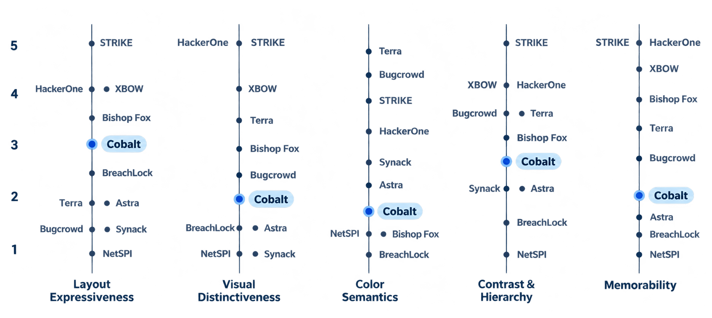
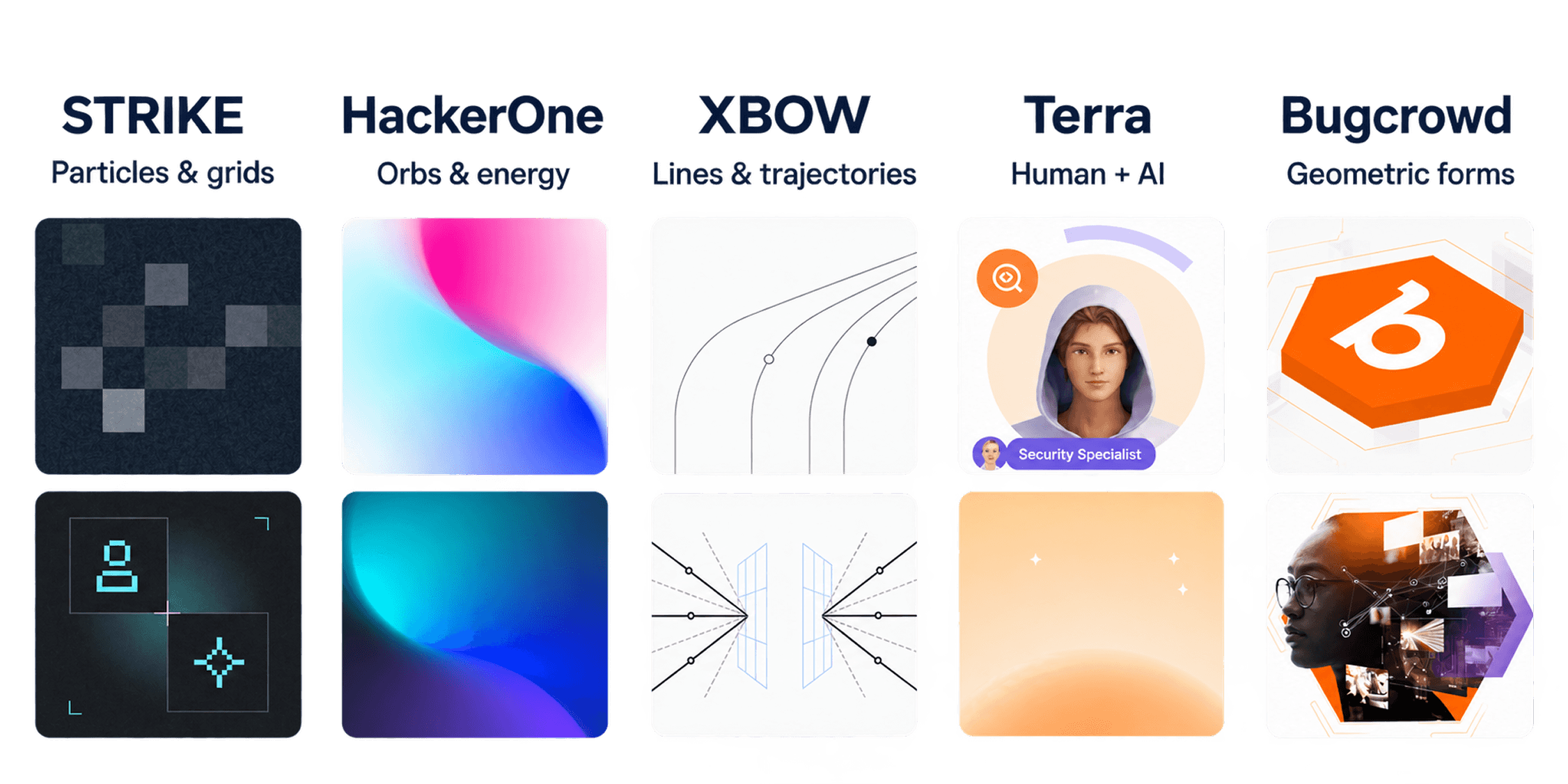
I partnered with Brand and Marketing to assess the landscape, align stakeholders, and explore a shared identity across the website and product.

MY ROLE
  • Competitive analysis
  • Workshop leadership
  • Concept exploration
  • Product design language
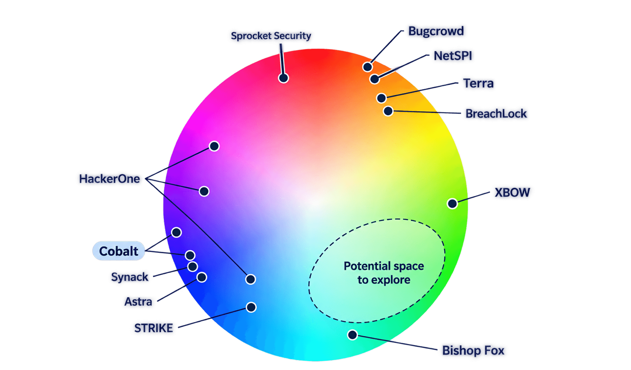
Competitors’ brand colors mapped on a color wheel, clustered in blues and purples
COLOR LANDSCAPE

Blues and purples crowd the category

I mapped competitors’ brand colors to understand where Cobalt blended into the category and where there might be room to differentiate. The concentration of blues and purples prompted us to explore how color could give Cobalt a more distinctive presence while retaining its recognition.

Aligning stakeholders around who Cobalt is

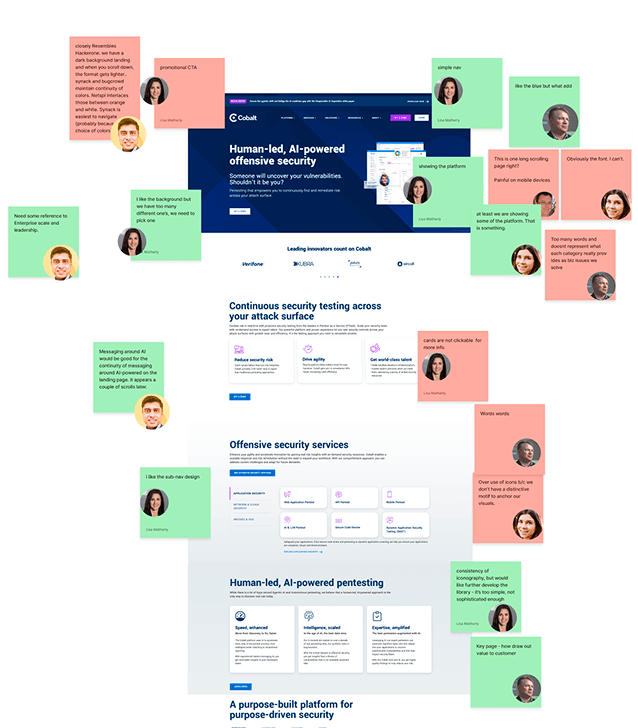
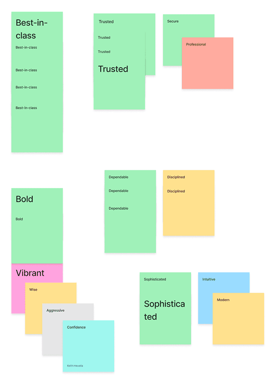
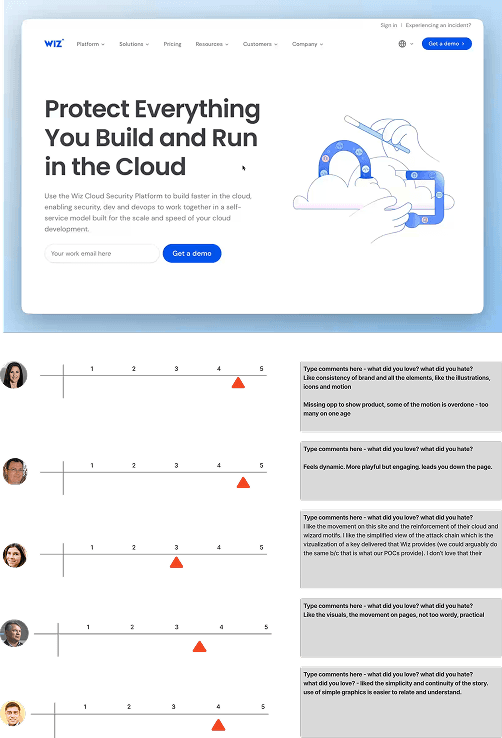
I led a stakeholder workshop to critique the current experience, define Cobalt’s personality, and explore aesthetic preferences.

Workshop board critiquing Cobalt’s existing brand

Brand critique

We examined where Cobalt’s existing identity supported our ambitions—and where it fell short.

Personality traits sorted into what Cobalt is and is not

Personality exercise

We aligned on the traits Cobalt should embody, and what it should never feel like.

Visual references with stakeholder ratings

60-second gut test

Stakeholders quickly rated visual references to uncover shared preferences and guide exploration.

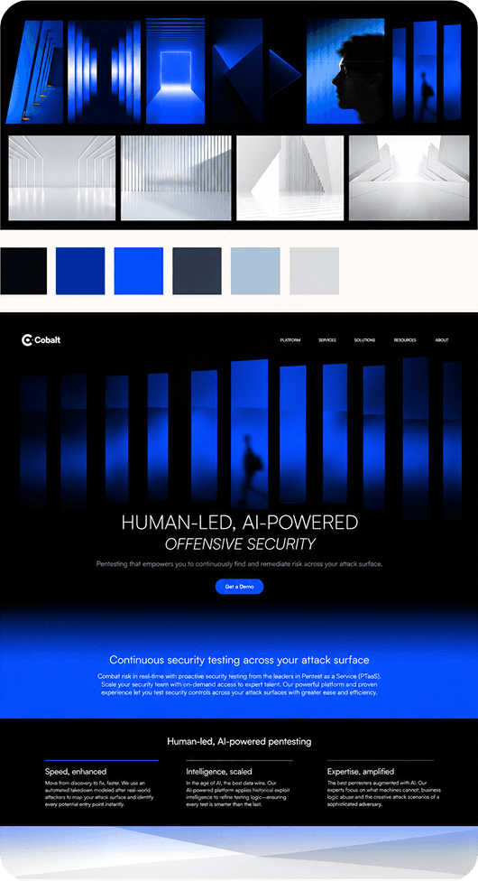
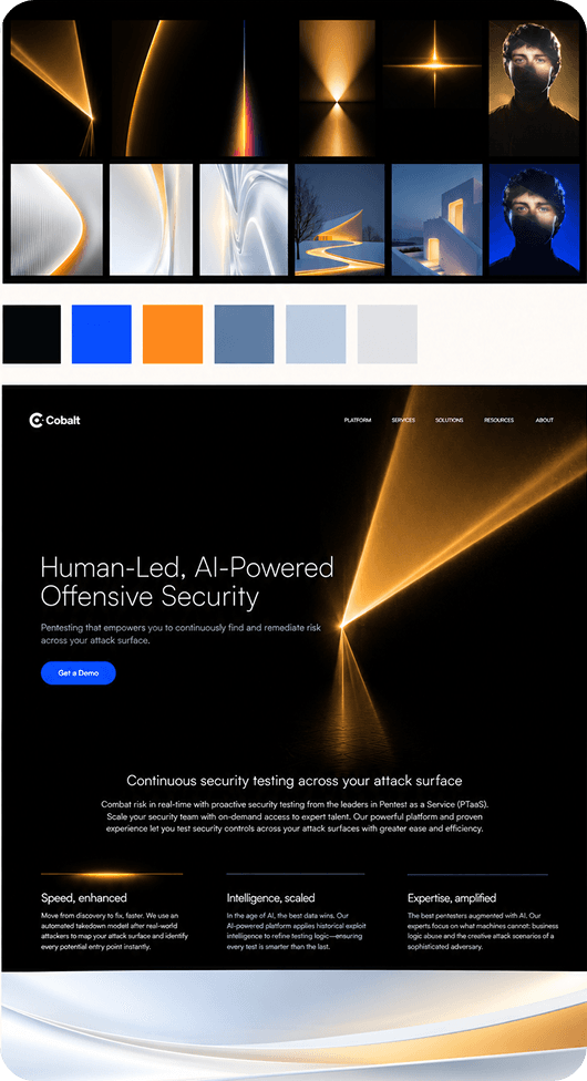
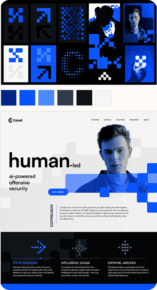
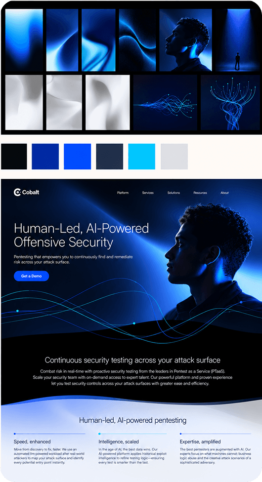
Four concepts, built independently and refined together

The brand designer and I developed concepts independently, then shared ideas and built on each other’s work through successive iterations.

  1. OPT 1.

    Layers

    Layers concept: mood board, color swatches and homepage
  2. OPT 2.

    Dynamic light

    Dynamic light concept: mood board, color swatches and homepage
  3. OPT 3.

    Flexible pixels

    Flexible pixels concept: mood board, color swatches and homepage
  4. OPT 4.

    Precision

    Precision concept: mood board, color swatches and homepage

I drove the groundwork and contributed hands-on concepts throughout. Brand led the final concept presentation.

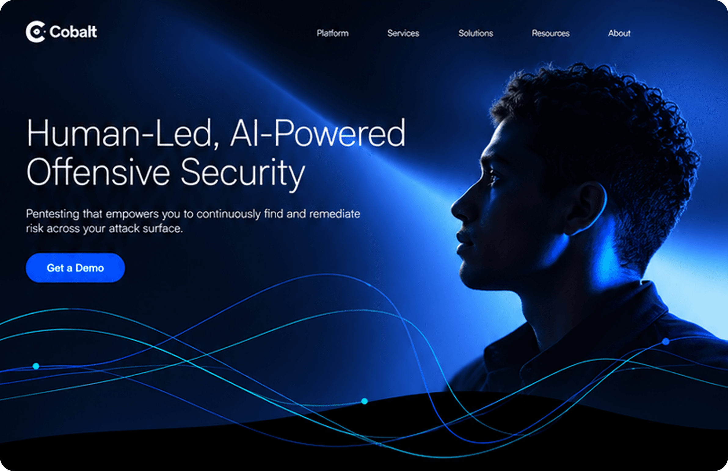
THE SELECTED DIRECTION

Precision

Human imagery. Controlled light. Fine, flowing trajectories.

Cobalt homepage concept in the Precision direction
FROM BRAND TO PRODUCT

Shaping Precision for everyday product use

I led the hands-on translation of the brand direction into Blueprint, adapting its colors, light, and linework for a consistent product experience.

EXTENDING THE PALETTE

Building the range a product needs

The brand direction used a focused, expressive palette. I extended those colors into a shared design system that could support everyday interfaces and accessible interactions.

Electric Sky
50
100
200
300
400
500
600
700
800
900
950
Glacier Blue
50
100
200
300
400
500
600
700
800
900
950
Midnight Current
50
100
200
300
400
500
600
700
800
900
950
Fog
50
100
200
300
400
500
600
700
800
900
950
DESIGNING BOTH THEMES

Leading with dark mode

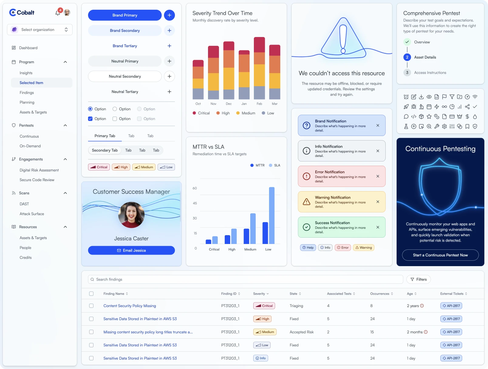
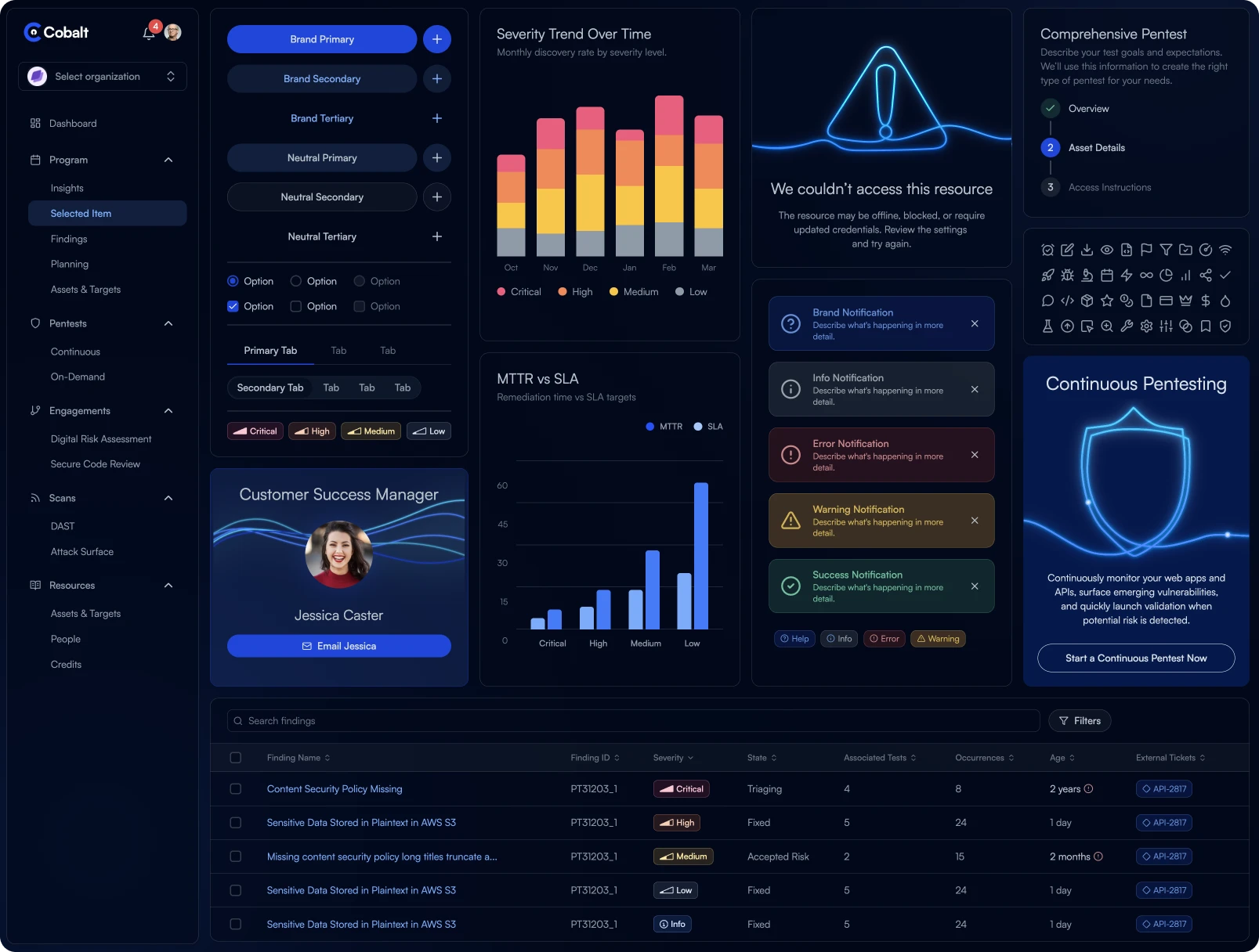
We led with a dark experience that made Precision’s controlled light and depth visible, while developing a light theme with the same visual identity.

Blueprint interface in light mode
The same Blueprint interface in dark mode
Drag to compare the same interface in both themes. Use the left and right arrow keys to adjust, Home for light, or End for dark.
A DISTINCTIVE ILLUSTRATION LANGUAGE

Giving product moments a Cobalt signature

Continuous-line illustrations echo the brand’s flowing light trails, bringing its signature motif into the product.

Welcome
Empty
Configured
Error
Success
Secure
Pentester
Sent
LINES AND LIGHT IN CONTEXT

Carrying the motif into the interface

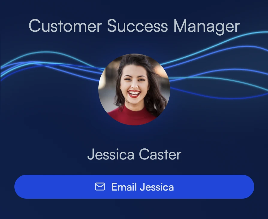
I adapted flowing trajectories and blue glows into selected product moments, giving the brand room to express itself while keeping everyday workflows clear.

Flowing blue and cyan brand trajectoriesThe brand's flowing blue light adapted into a customer success manager card

For years, the design process followed the same steps. Bringing an idea to life meant describing it slowly, across many deliverables.

Every step was manual. The work was recreated in a new format at each handoff, just to build confidence and validate the design.

And it took months.

There’s a better way.

AI made it possible for designers to create in code, with far less translation and effort.

Here’s how we did it at Cobalt.

CHANGE HOW THE TEAM CREATES

A new design language.
A new way to build.

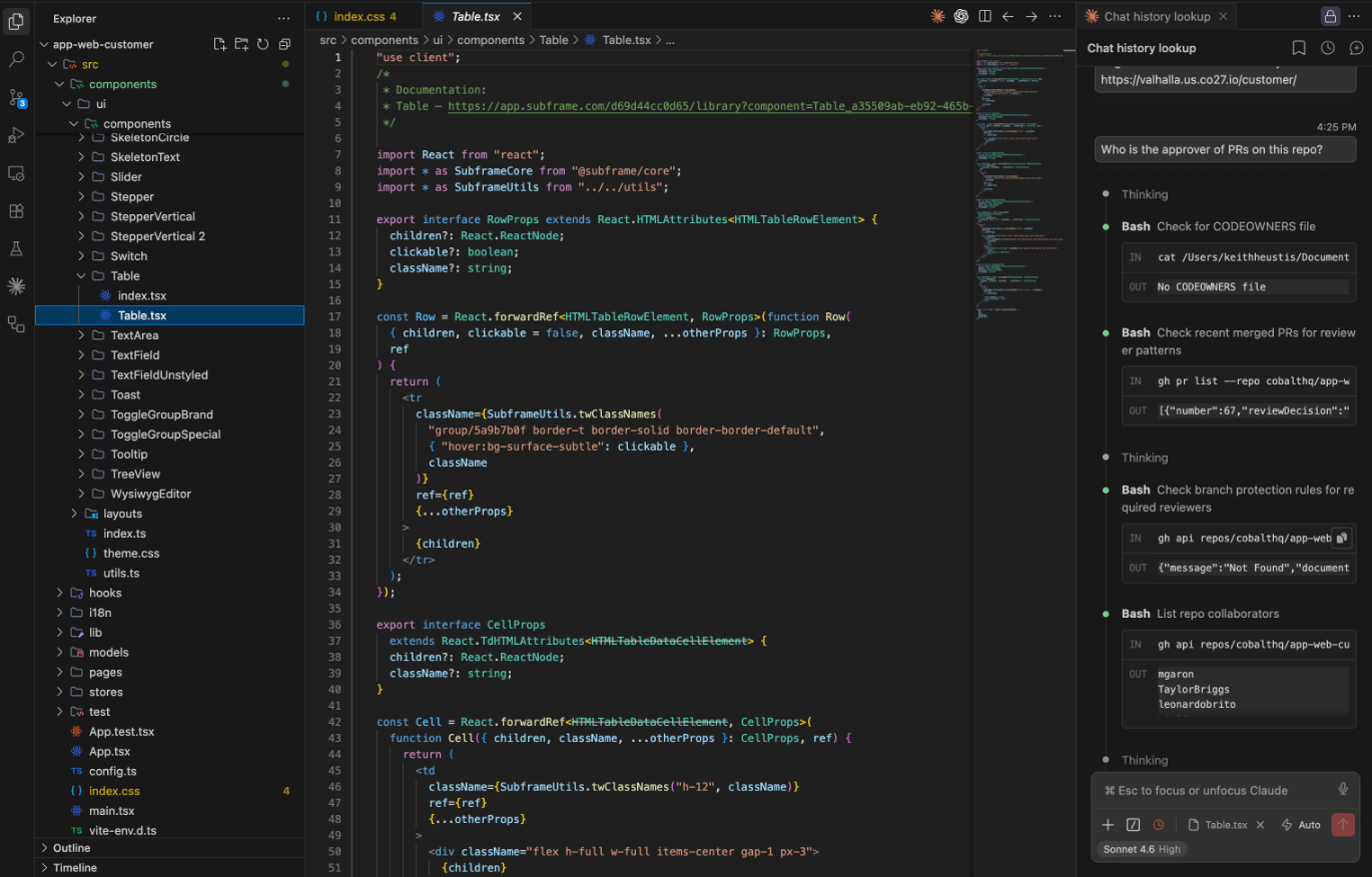
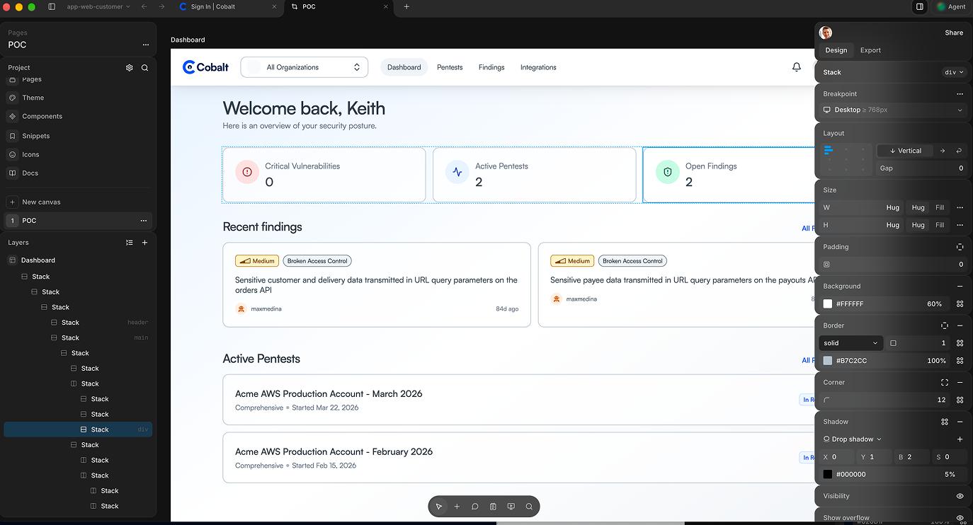
I evaluated AI tools, built reusable components in Subframe, and partnered with our VP of Engineering to test designer-authored code and pull requests.

Skip tool selection

Finding the right tools and building the approach together

I led an evaluation of AI tools and models to explore how we could change the way we designed and built at Cobalt. I brought Engineering in early, pairing our design experiments with their evaluation of front-end frameworks and implementation needs.

THE LANDSCAPE

The challenge was consistency.

Could AI help us move faster while staying faithful to our components, tokens, and design decisions?

THE LANDSCAPE

What made the cut?

We narrowed the field to options that gave designers control, fit how engineers work, and could support AI in the workflow.

Styling foundation
WHY TAILWIND

A shared styling language

Tailwind gave Design and Engineering a common way to express layout, spacing, and visual decisions in code.

Component foundation
WHY RADIX

Behavior beneath the visual layer

Radix provided accessible UI primitives beneath the styling—a component foundation both approaches could build on.

AI Assistance
WHY CLAUDE

AI support for working in code

In our trials, Claude stood out for coding capability and flexibility.

Bringing it together
BRINGING IT TOGETHER IN SUBFRAME

A common direction for Design and Engineering

Tailwind for styling and Radix for accessible UI primitives gave Design and Engineering a shared foundation. Subframe brought those same tools into a visual design workflow.


A shared proof of concept

We tested the new workflow in a working Cobalt prototype—bringing reusable components, responsive UI, and GitHub pull requests into one shared process.

Different expertise. One codebase.

Engineering focused on architecture, performance, and security. I focused on UI, layout, and content—with shared review and iteration.

Engineering focus
Architecture
Performance
Security
Collaborate in code
ENG
UX
Shared review and iteration
UX focus
UI modifications
Layout refinements
Content edits

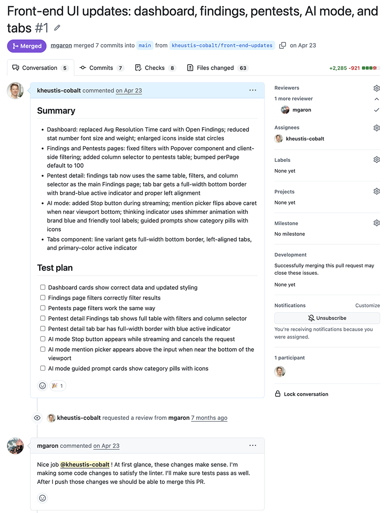
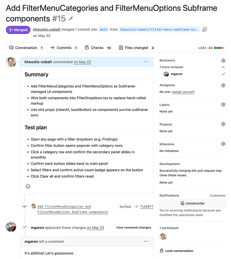
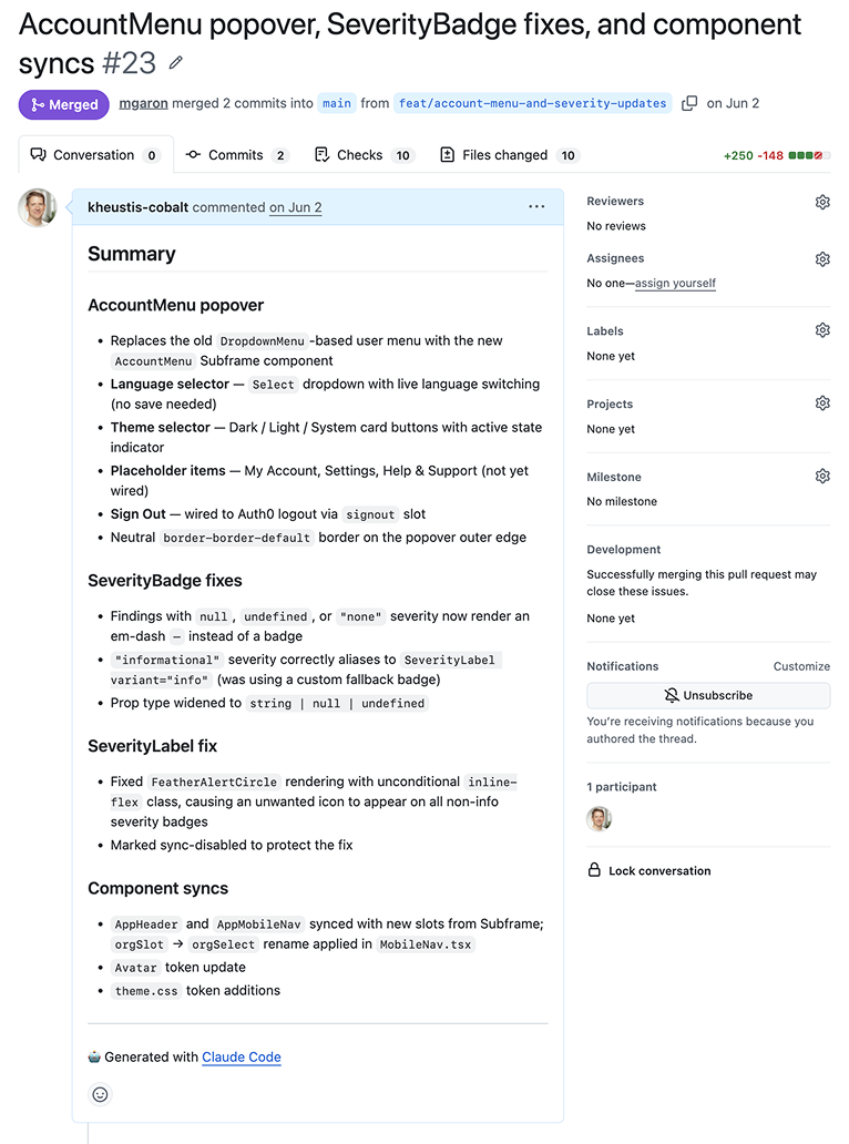
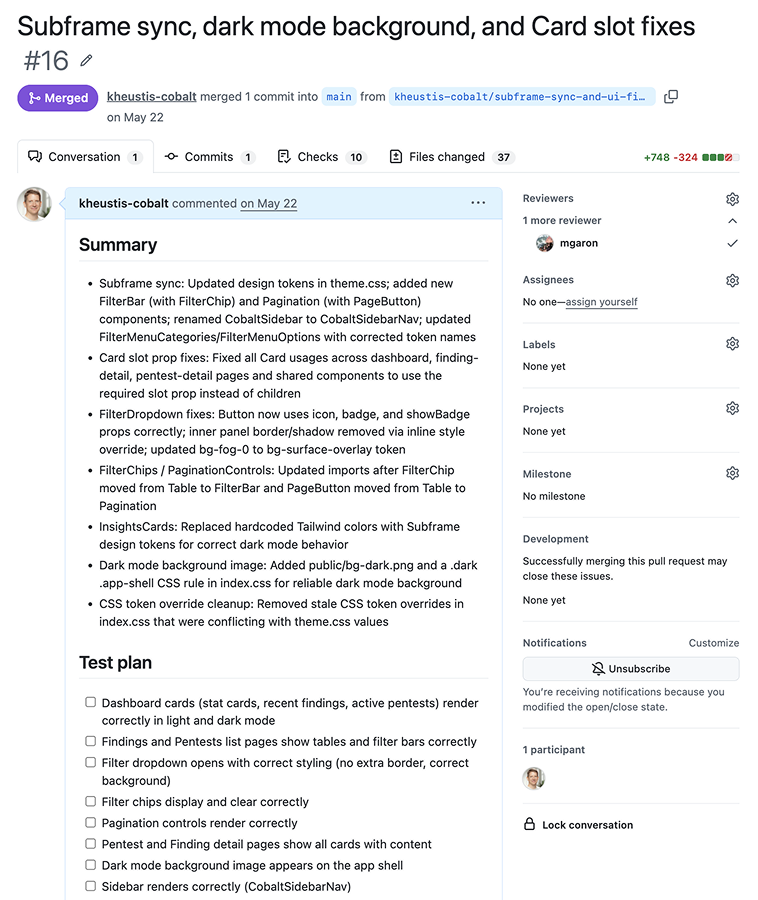
My first pull requests

The experiment became real contributions: UI updates, reusable components, and fixes reviewed and merged with Engineering.

Building the system behind the new experience

With the workflow proven, I built out the design system in the new visual language—defining tokens, reusable components, and guidance—then began applying it to production UI.

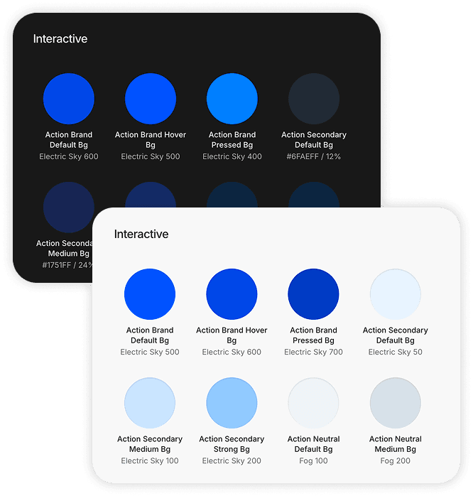
Light and dark interactive color tokens

Tokens

I translated the new visual language into shared color, type, and spacing tokens—a consistent foundation for every screen.

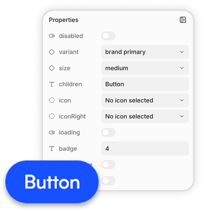
Reusable button component with editable properties

Components

I built reusable components with defined variants and states, connecting design decisions to the UI we would build in code.

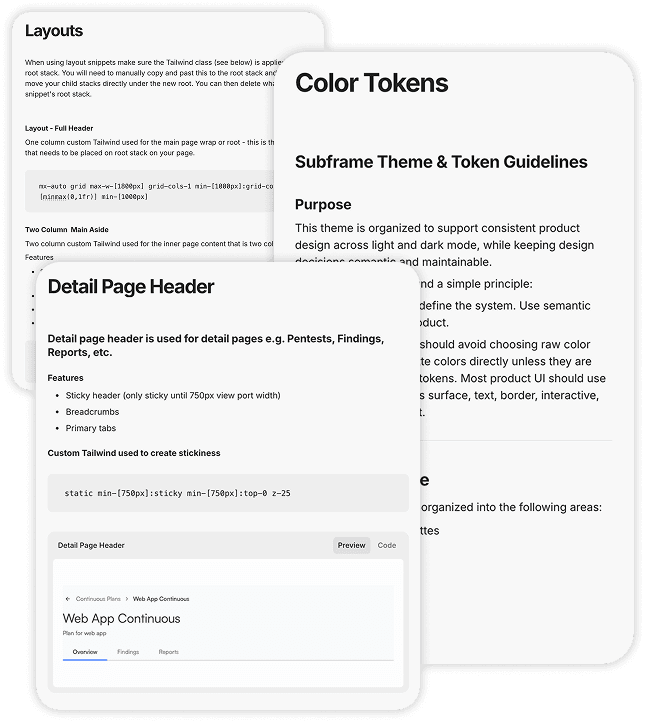
Design system documentation for tokens and page layouts

Documentation

I documented how and when to use the system, giving Design, Engineering, and AI a shared guidance beyond the components themselves.

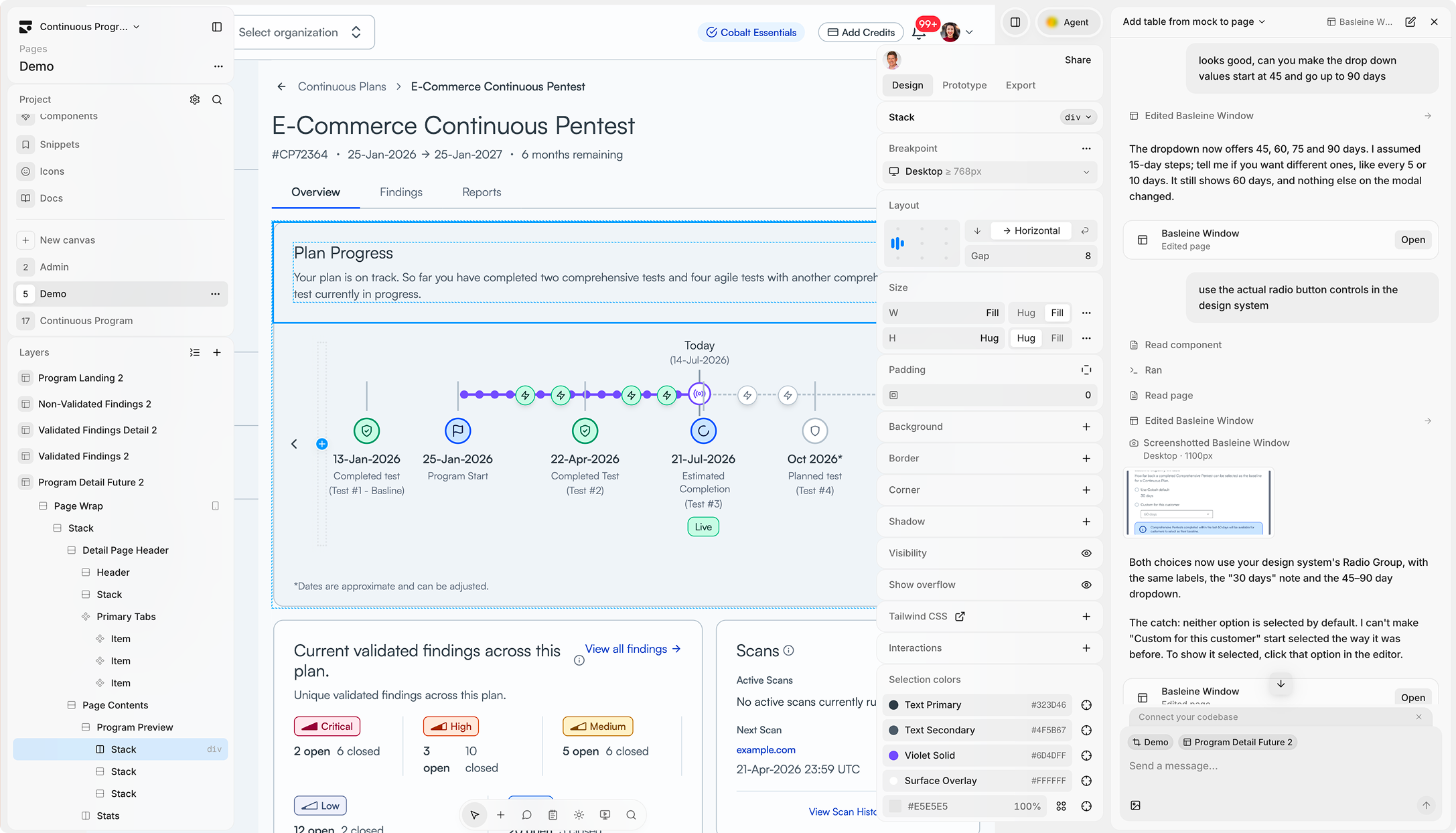
Putting the system to work: I began designing production UI for Continuous Pentesting, using the shared components and refining them against real product needs.

06THE CASE FOR CHANGE

Making the business case for a new front end

I partnered with Mike, our VP of Engineering, to show how the legacy front end was increasing security risk, slowing delivery, and creating recurring costs—making modernization a business priority, not just a technical upgrade.

The legacy front end was holding us back

Our legacy front end contained the majority of our unresolved security exposure and slowed our ability to deliver.

161Open security alerts

2 critical, 55 high, 80 medium, 24 low

100SLA-breaching alerts

59% of all 169 breaches across the organization

110Open Jira items

Technical debt, framework upgrades, and maintenance backlog

25min
Average CI time

Across 20 workflows, at ~21.5 PRs/week

A modern architecture changes the economics

The target architecture would reduce complexity, cut recurring maintenance, and accelerate delivery—giving the team more time to build for customers.

Architecture
TODAY

Legacy

cobalt-app-web
TARGET

Modern

Blueprint front end
Language

~87% JavaScript

100% TypeScript

Stronger typing, fewer runtime issues

Handwritten code

~318,000 lines across 43 packages

~10–12× smaller

Consolidated, easier to understand

Dependencies

197 total: 114 runtime + 83 dev

~66 total

Fewer dependencies, lower risk

Test tooling

Two runners: Jest + Vitest

One runner: Vitest

Simpler, faster, easier to maintain

CI per change

~25 minutes

2–3 minutes

~8–10× faster CI feedback

Dependabot backlog

13 open

0

No backlog, designed to stay that way

The hidden cost of the current front end

Every quarter, the team spent time paying down the same technical debt instead of delivering customer value.

Feature delivery drag

~10 FTE × 50% feature work × 15% throughput uplift foregone

$135K
Dependency & security remediation

~825 hrs: routine bumps plus repeated structural upgrade attempts

$83K
Security risk

Risk-adjusted expected cost of ~1 avoidable incident

$50K
CI pipeline drag

~410 CI wall-clock hrs/yr; 30% productivity loss plus compute

$20K
Estimated annual cost

These costs don’t show up in a single line item, but they impact every team and every release.

~$285Kper year
BRINGING THE VISION TOGETHER

Defining the next generation of Cobalt

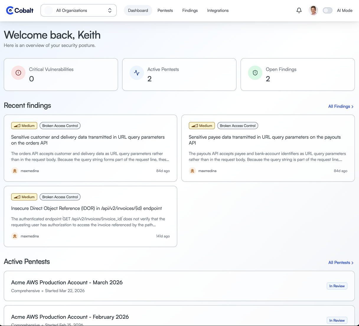
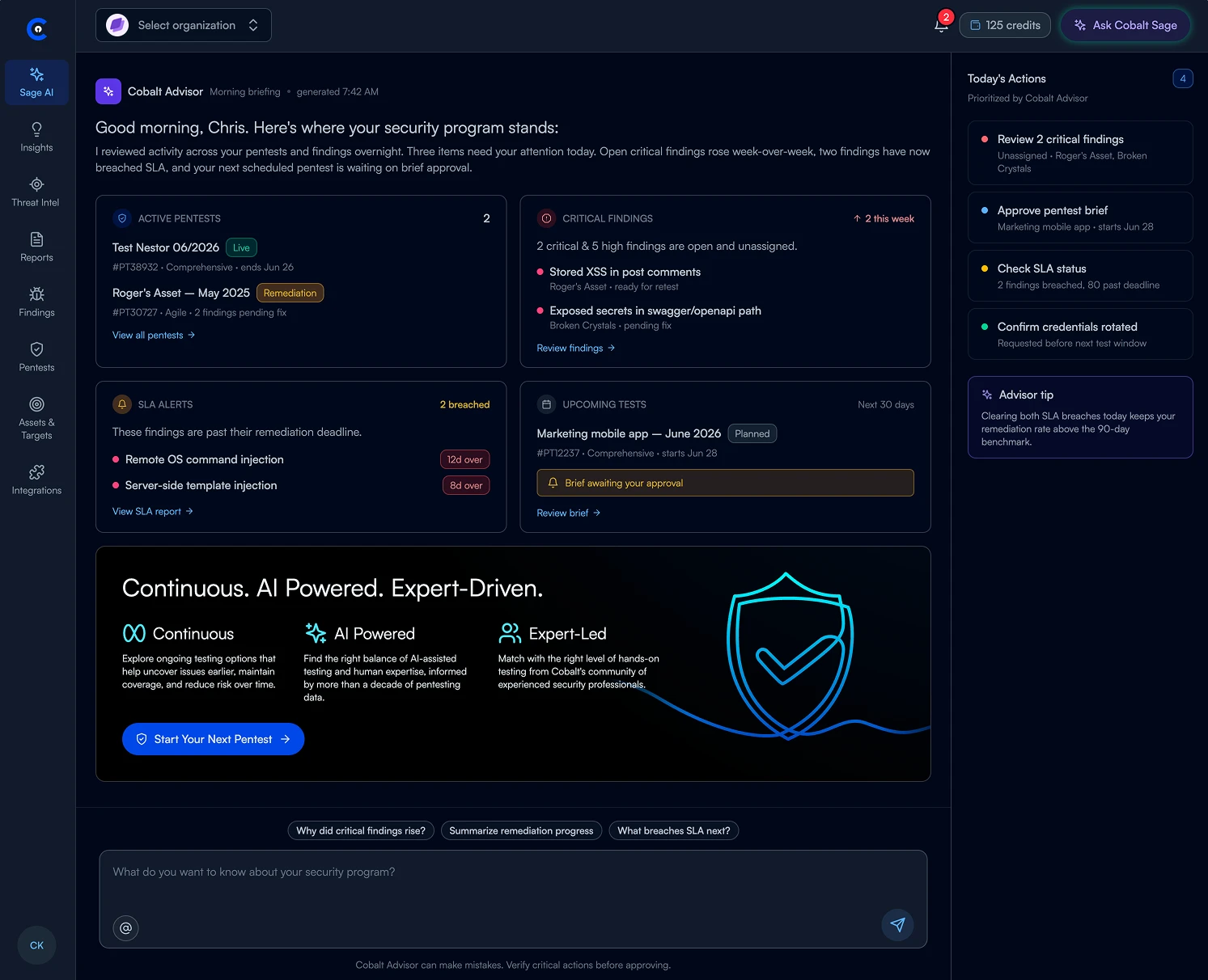
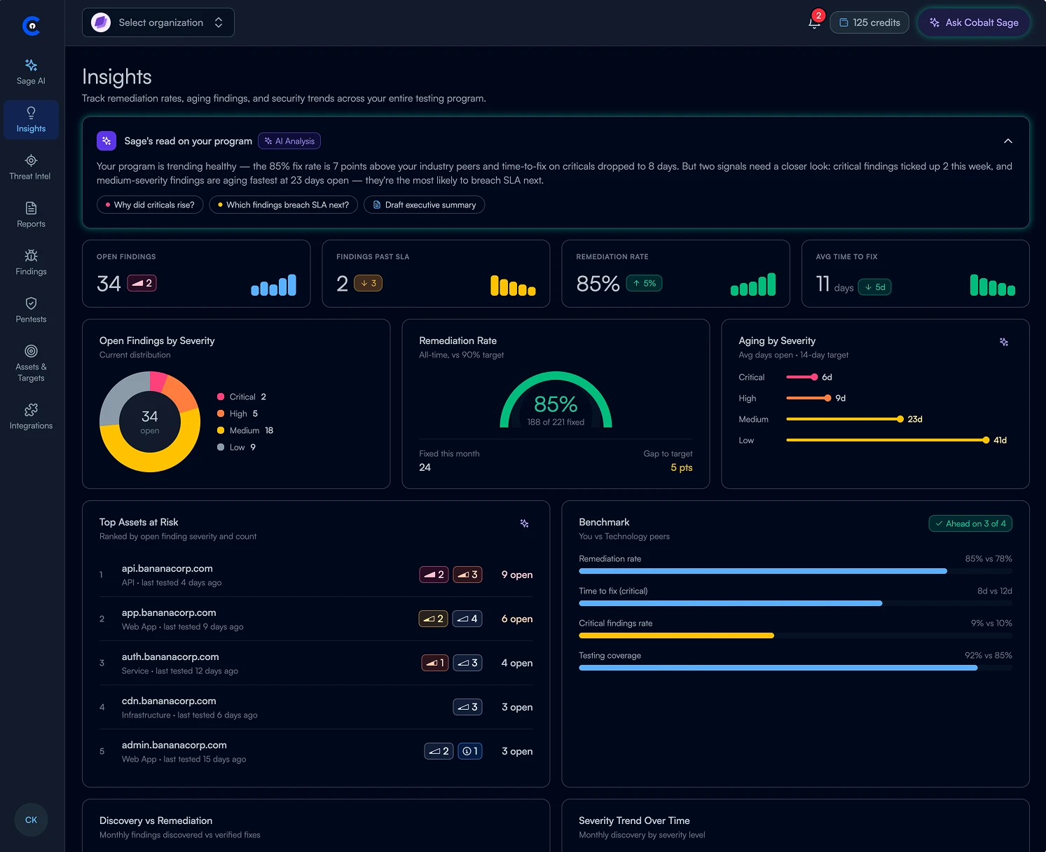
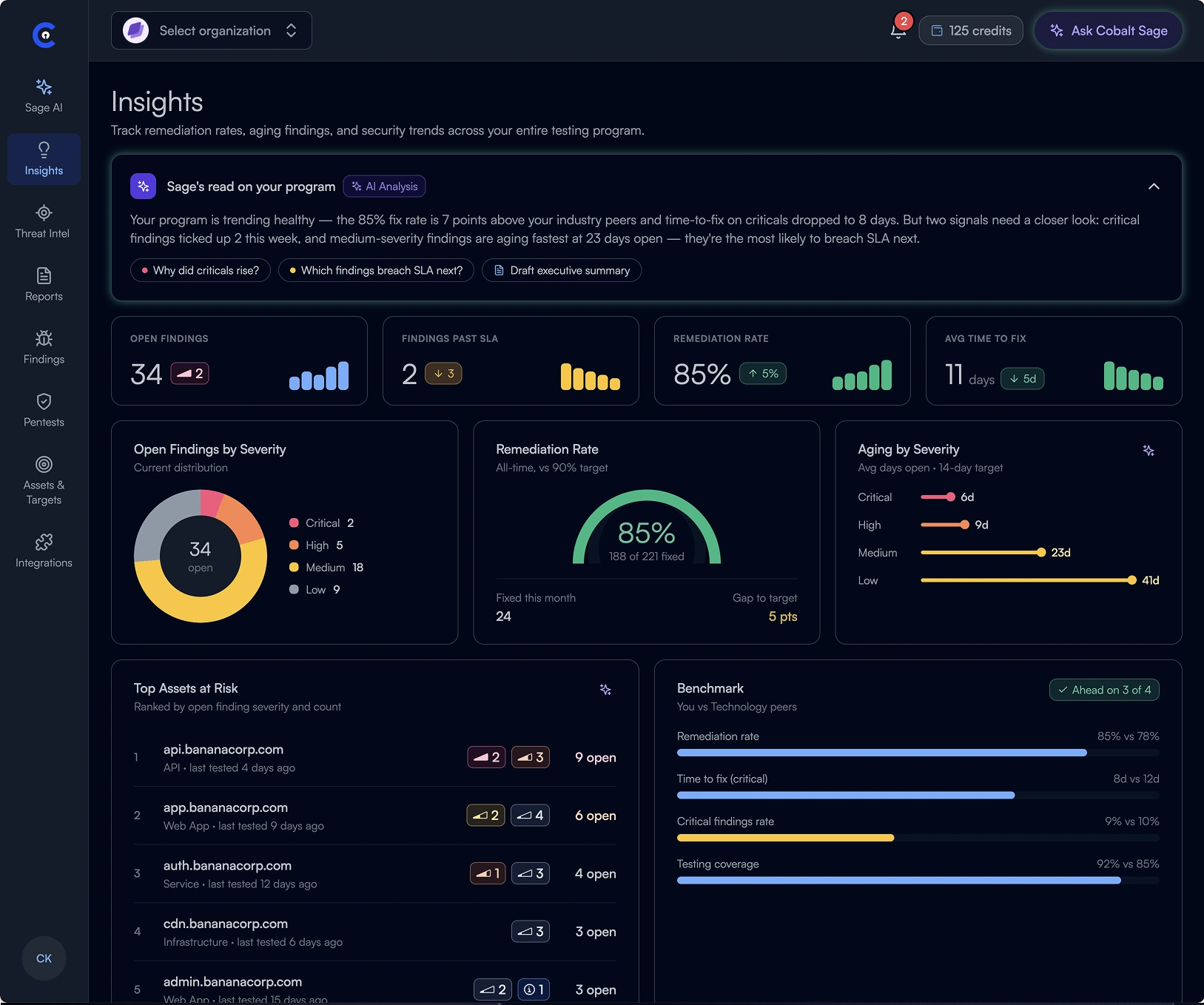
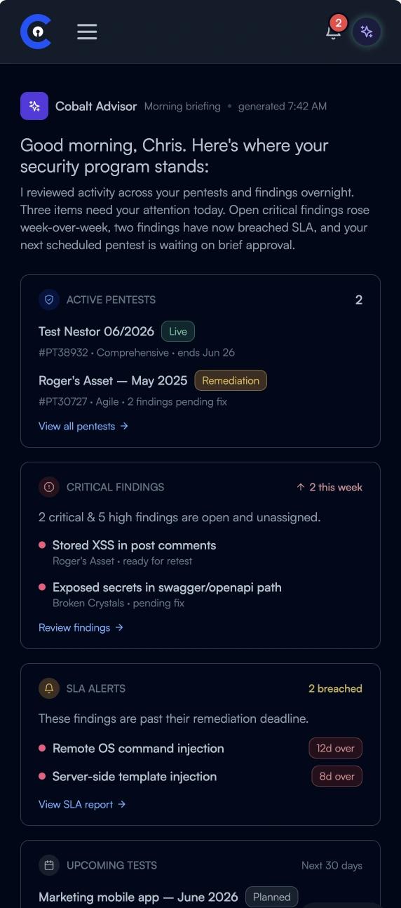
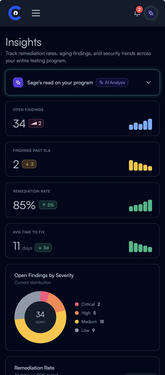
We brought our research, refreshed design language, reusable components, and new delivery approach together into Cobalt NEXT.

Chris, our Staff Designer, was central to bringing the concept to life. I partnered with Mike, our VP of Engineering, on the implementation strategy and presented the vision to executive leadership.

Cobalt NEXT desktop: Know what needs attention
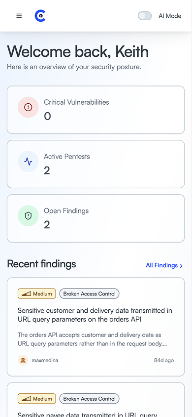
Cobalt NEXT mobile: Know what needs attention
Story 1 of 4. Know what needs attention. Bring priorities, recommendations, and outstanding work into one starting point.

Identifying where to focus the redesign

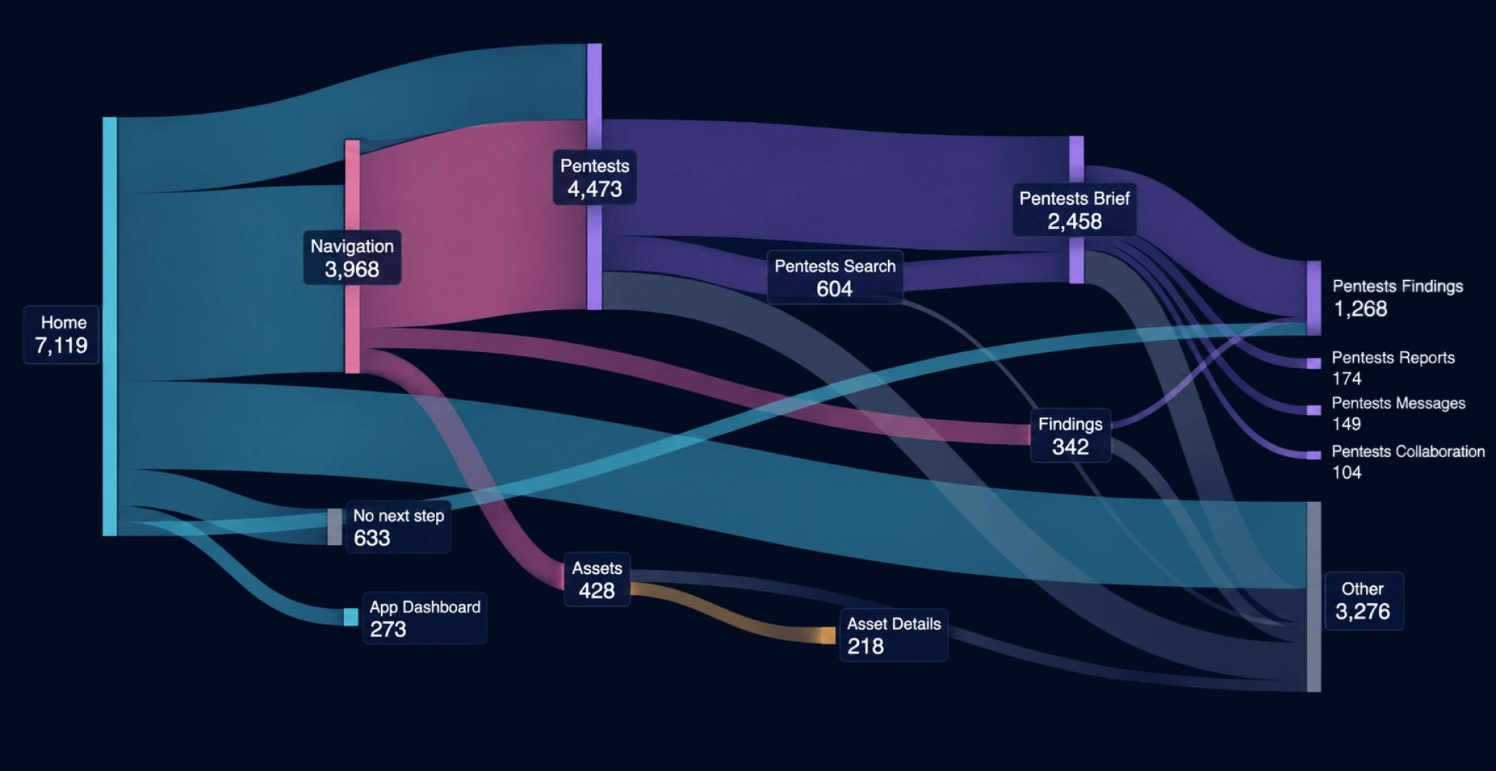
We analyzed Pendo usage data to understand how customers navigated Cobalt and which workflows they returned to most. Combined with our UX audits and research, these patterns helped us prioritize pentests, findings, and assets as the starting point for the new experience.

Pendo navigation Sankey: customer paths from Home through navigation, pentests, findings, and assets.

Simplify the navigation

Organize the information architecture around core customer workflows, making important destinations easier to find.

Focusing on what matters

Identify opportunities to consolidate underused features and reduce clutter accumulated as the product expanded.

Reducing workflow friction

Create clearer paths between pentests, findings, and assets so customers can understand their security program and act with fewer detours.

Skip navigation walkthrough
Cobalt’s redesigned navigation, grouping core security workflows into fewer destinations.
A CLEARER WAY THROUGH

Landing pages brought related features together, giving customers fewer destinations to navigate.

The number of navigation items was reduced from 17 to 8.

GUIDANCE IN CONTEXT

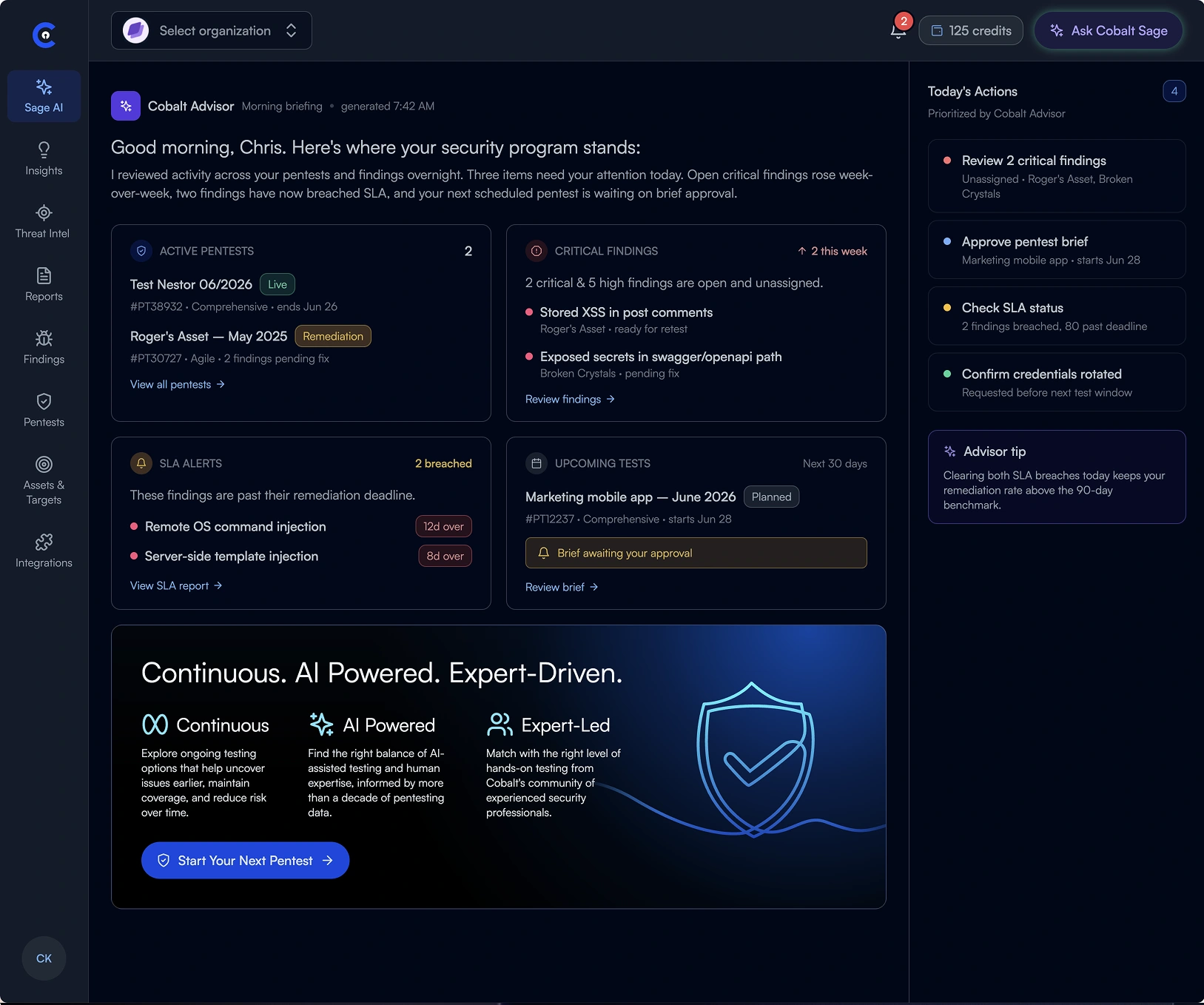
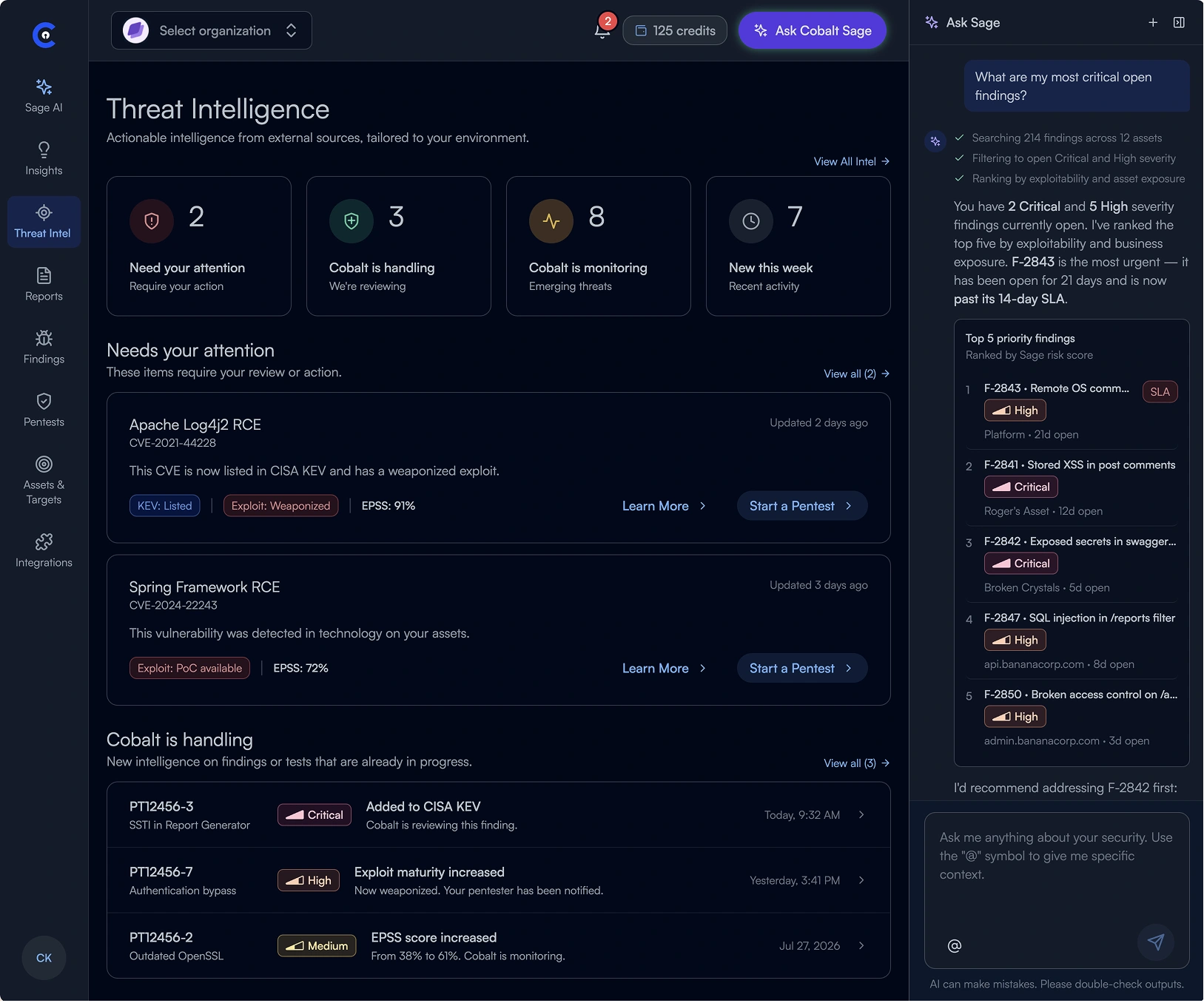
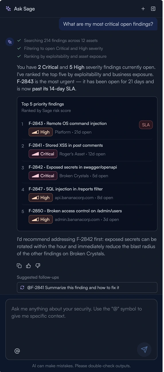
Bringing AI into the workflow

Sage helps customers understand their security program, summarize findings, and decide what to do next.

DETAILS THAT SUPPORT THE WORK

Making everyday work easier

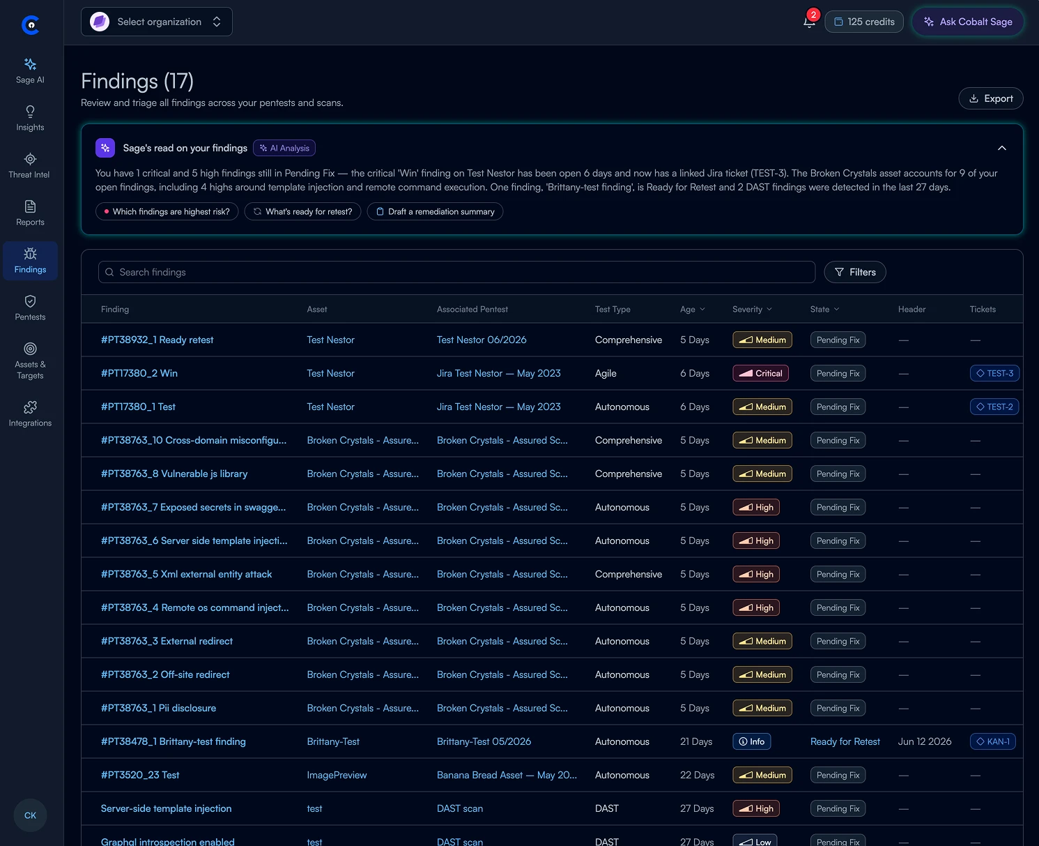
Clearer status, structured data, and flexible views help customers make sense of complex security information.

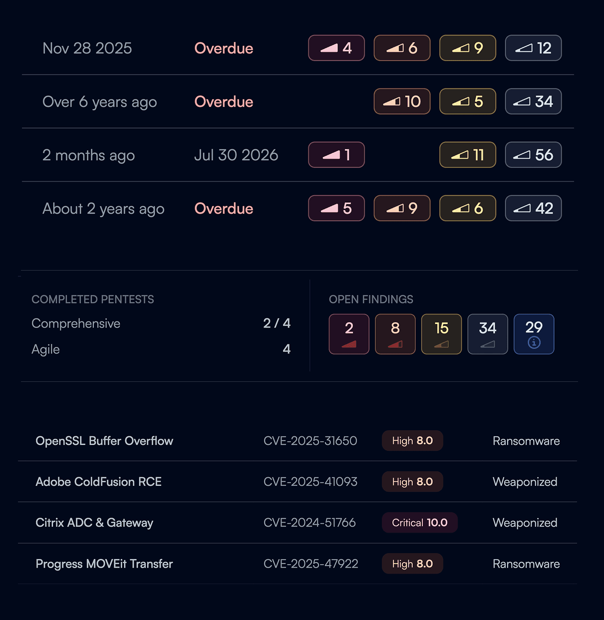
Status that is easier to scan

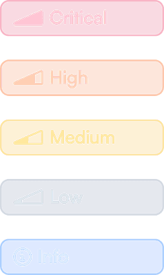
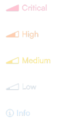
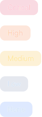
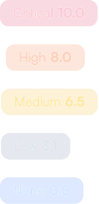
Consistent severity and state badges make important differences visible across findings and CVEs.

Cobalt severity
LABELEDCobalt labeled severity badges: Critical, High, Medium, Low, and Info.
GHOSTCobalt ghost severity badges with distinct severity icons.
COMPACTCompact severity badges combining an icon with a finding count.
Third party severity
OWASPOWASP severity labels: Critical, High, Medium, Low, and None.
CVSSCVSS scores: Critical 10.0, High 8.0, Medium 6.5, Low 3.1, and None 0.0.
Severity badges applied across pentest status rows, an open-findings summary, and CVE listings.
Tables that adapt to the task

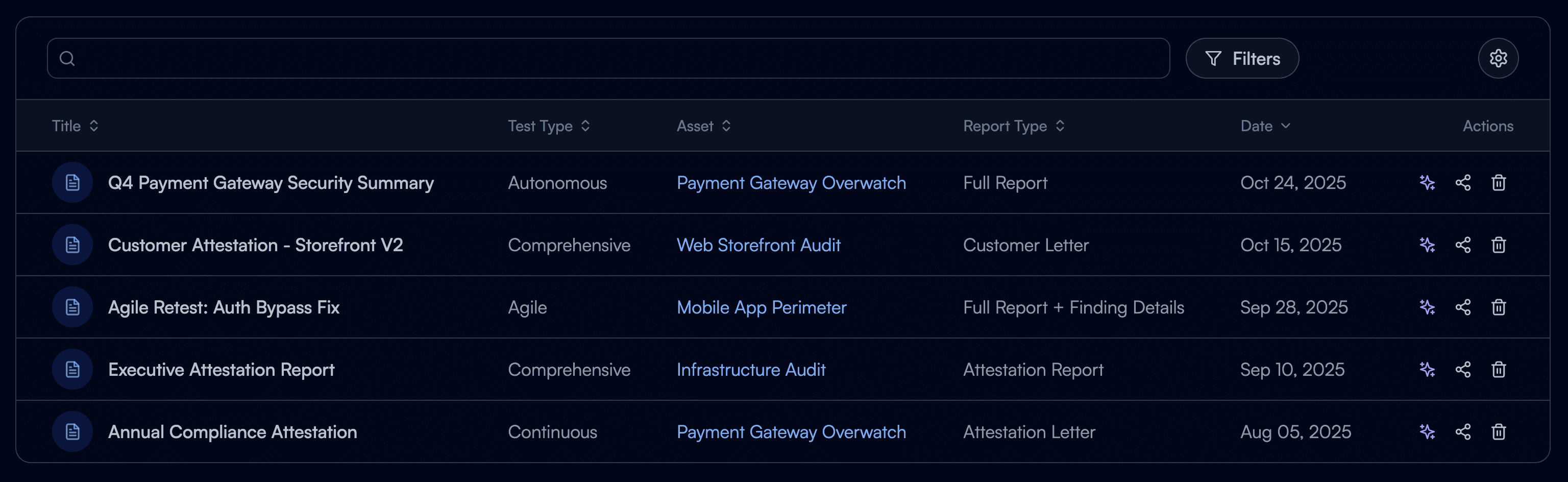
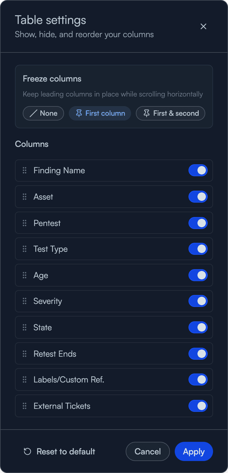
Structured cells, reusable filters, and column controls give customers more control over the information they need.

Customize your view
Customizable report table with one value per cell and separate columns for title, test type, asset, report type, and date.
Table settings for freezing, showing, hiding, and reordering columns.
Powerful compact filtering
A CLEARER VIEW OF PROGRESS

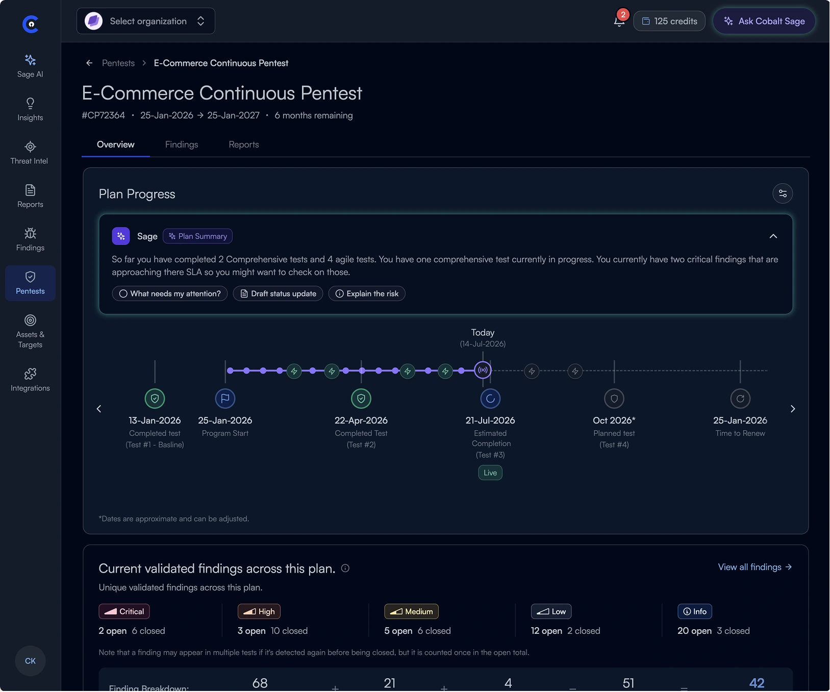
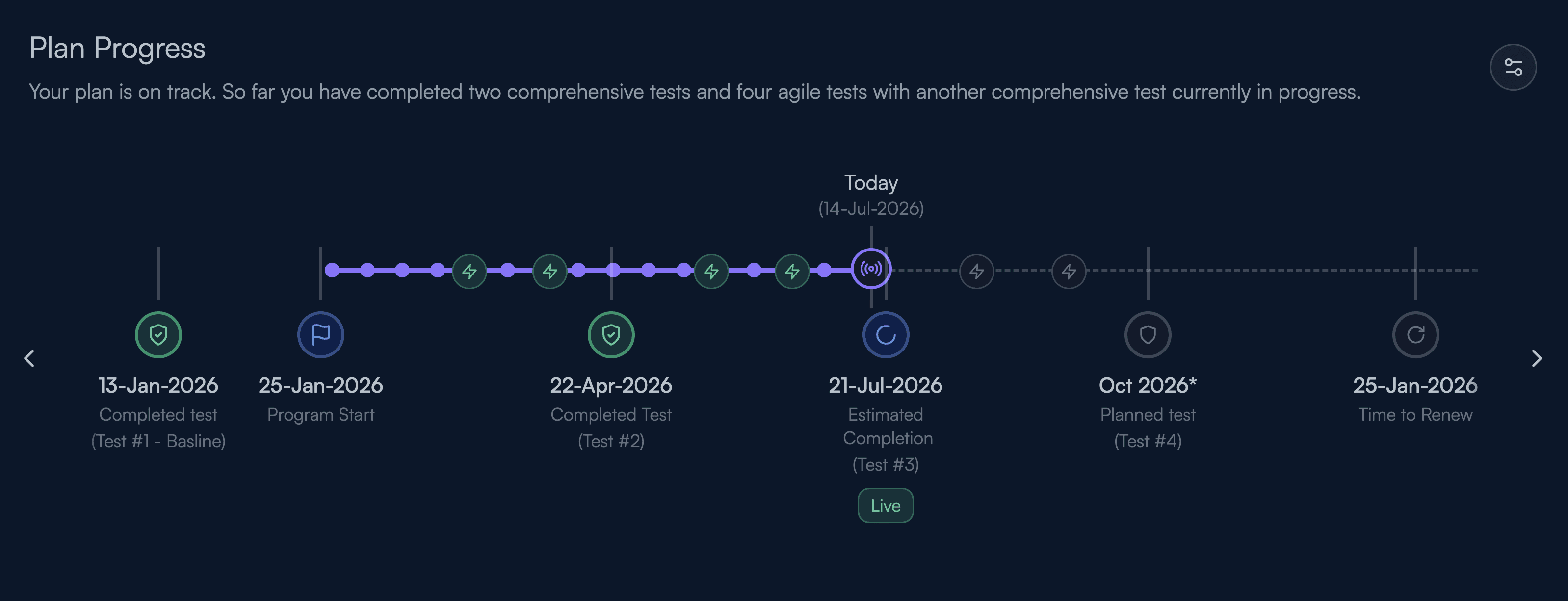
Making continuous testing tangible

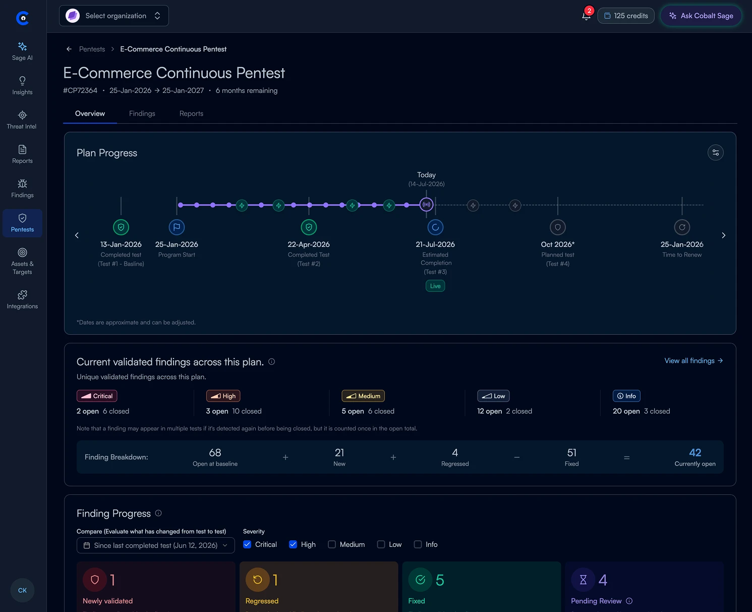
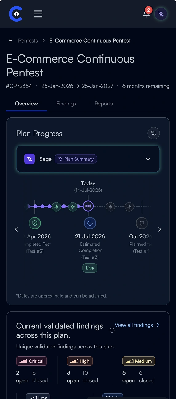
A shared timeline makes past, active, and upcoming testing easier to follow.

Plan progress timeline showing completed tests, the program start, active testing, upcoming tests, and renewal.

GUIDED PENTEST SCOPING

Making it easier to start a pentest

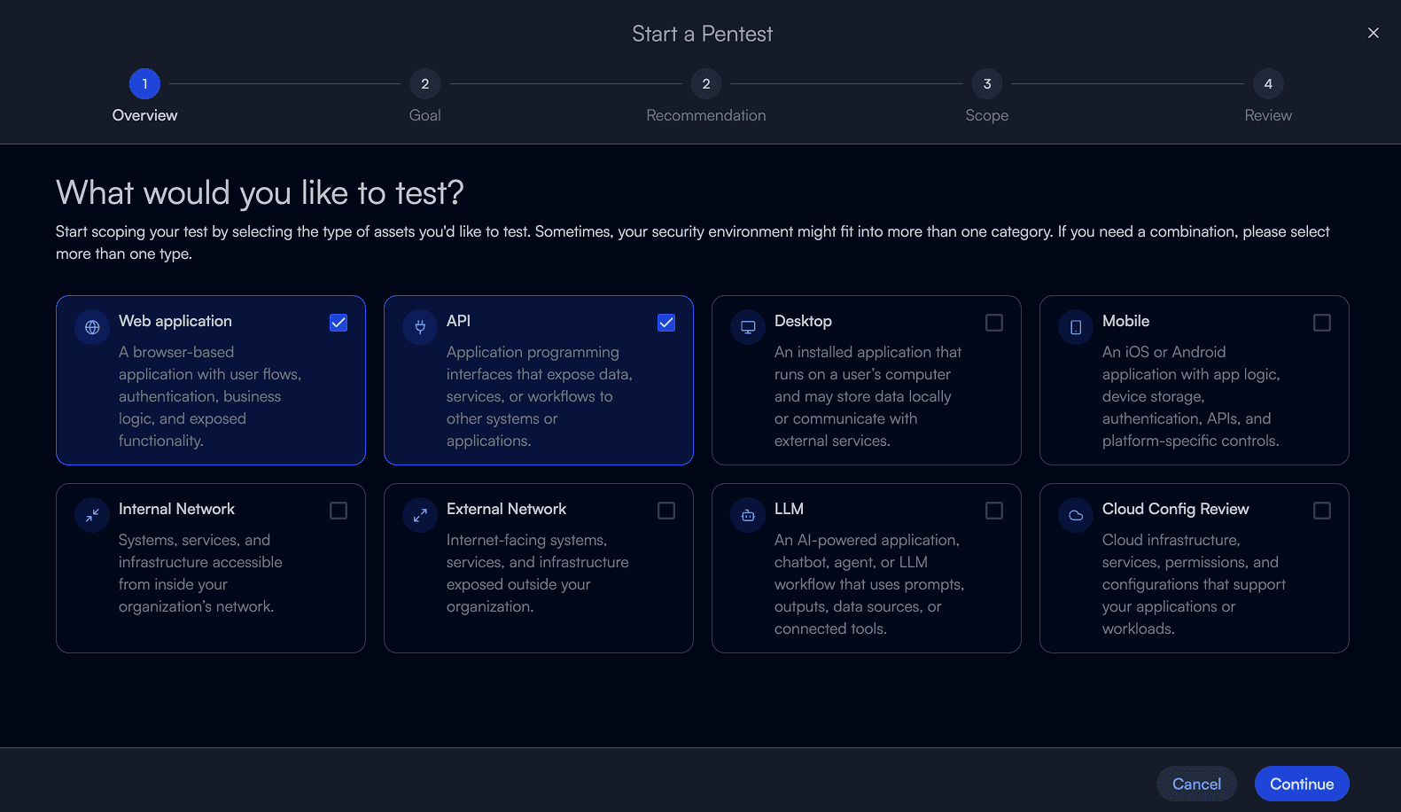
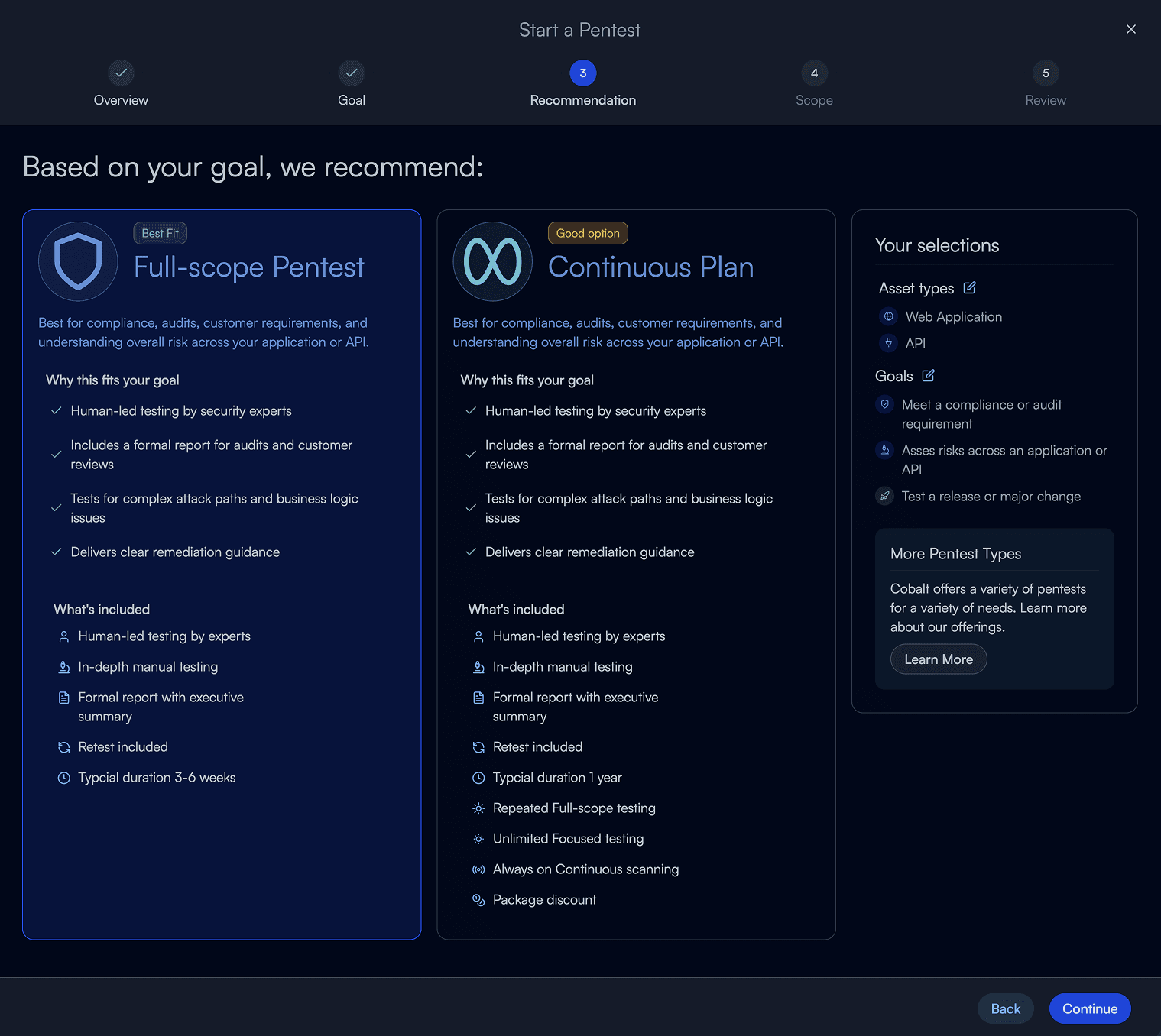
I reimagined scoping with the simplicity of a consumer experience. Clear choices, goal-based recommendations, and step-by-step guidance help customers define what they need, while a direct path lets experienced users move straight to setup.

Guided pentest scoping: choose the asset types to test, including web applications, APIs, networks, mobile, and LLMs.
Goal-based pentest recommendations comparing a full-scope pentest and continuous plan alongside the customer’s selected goals.
08

From customer feedback to a delivery plan

We put Cobalt NEXT in front of customers, revisited our UX baseline, and worked with Product and Engineering to define what to build first.

Testing the work customers come here to do

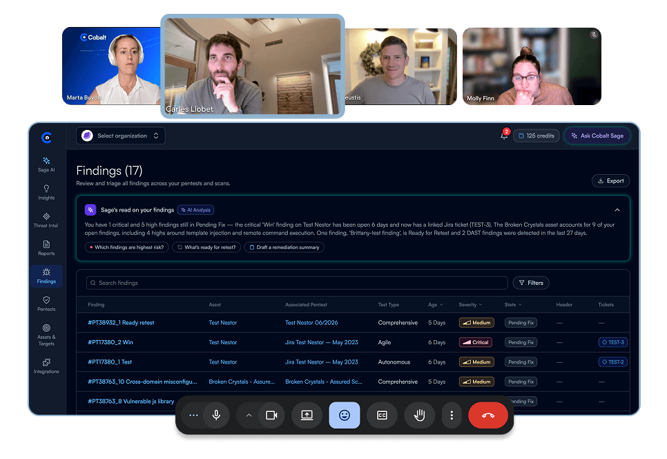
Customers used the prototype to find priorities, check pentest progress, and scope a new test. We looked for where the experience supported their decisions—and where it got in the way.

Customer testing session with the Cobalt NEXT findings prototype shared on screen.

A customer session exploring the Cobalt NEXT prototype.

I know which API is changing and when it goes live. I don’t always know what kind of pentest to ask for. Starting with what I’m trying to cover and seeing why a test is recommended makes that decision easier.
Carles L.Application Security EngineerPersonio
01 / 03
Feedback 1 of 3: Carles L.. I know which API is changing and when it goes live. I don’t always know what kind of pentest to ask for. Starting with what I’m trying to cover and seeing why a test is recommended makes that decision easier.

Measuring the experience against the same baseline

We returned to the seven dimensions of UX to compare the prototype with the existing experience and identify where more work was needed.

Baseline and prototype comparison

Scores out of 100
Dimension
60708090100
BaselinePrototypeChange
Useful
65 · C88 · A+23
Usable
68 · C84 · A+16
Desirable
71 · C95 · A+24
Findable
75 · B92 · A+17
Accessible
71 · C96 · A+25
Credible
80 · A85 · A+5
Valuable
65 · C90 · A+25
Baseline experience
C
70.7out of 100

Seven dimensions, equally weighted

Cobalt NEXT prototype
A
90.0out of 100

+19.3 points over the baseline

Building the foundation for delivery

Cobalt NEXT is now in planning. A dedicated tiger team is establishing the technical foundations and running an exploratory spike and initial sprint to prepare the wider teams to build.

Explore the implementation

Use a focused spike to test the approach, surface dependencies, and resolve technical unknowns.

Establish the foundations

Set up the front-end architecture, shared components, and development patterns.

Prepare teams to build

Turn what we learn into a practical starting point for teams to begin delivering the new experience.

END CREDITS

You made it to the credits.

That was a lot of reading, but you made it! Thanks for sticking with me.

The people behind the work

Chris

Thanks for turning a big, messy vision into something people could actually try.

Cristian

Cristian

LinkedIn

Thanks for bringing a sharp visual eye and making the details feel intentional.

Lais

Thanks for bringing curiosity and trying new ways of working with AI.

Subframe

A special thanks to Subframe

Visit Subframe

A big thank you to Irvin, Filip, and the Subframe team for meeting with us weekly, listening to our feedback, and evolving the product to fit the way we work.

Still hungry for more?

Next up: a personalized Home for everyday work at Paylocity.

NEXT CASE STUDYNo place like HomeTurning a broader platform vision into a personalized home page that helps employees, managers, and HR admins find what matters and take action.VIEW CASE STUDY

Case study coming soon

Explore Paylocity